 EN
EN
 AR
AR
 HR
HR
 CS
CS
 DA
DA
 NL
NL
 FI
FI
 FR
FR
 DE
DE
 EL
EL
 HI
HI
 IT
IT
 JA
JA
 KO
KO
 NO
NO
 PT
PT
 RU
RU
 ES
ES
 TL
TL
 ID
ID
 VI
VI
 HU
HU
 TH
TH
 TR
TR
 MS
MS
 GA
GA
 CY
CY
 MK
MK
 HY
HY
 PL
PL

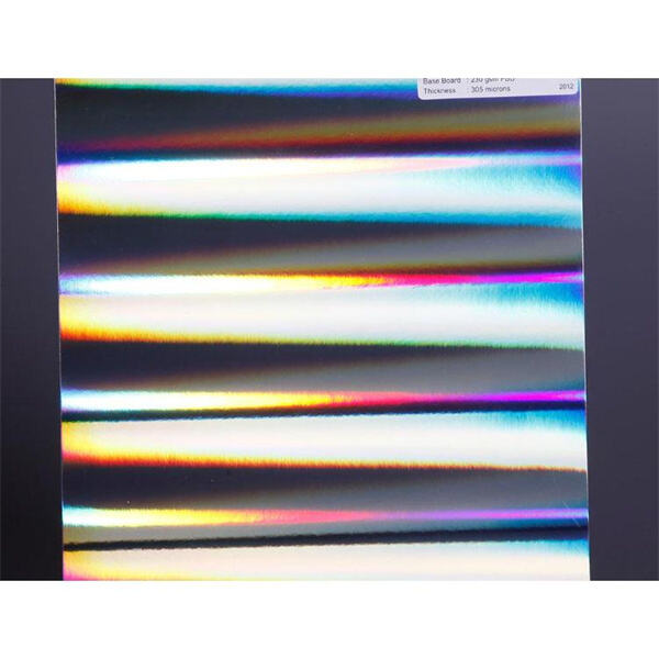
Heat transfer paper bursting with color will add a special touch that makes projects extra spectacular. When it comes to putting designs on T-shirts, bags, and even home goods selecting the right heat transfer paper is extremely important. At Shunho, we understand how you can make those vivid and vibrant colors for yourself. Read on for some tips to help your colors pop.
What Are the Best Papers for Heat Transfer on Full Color?
Not all heat transfer papers are created equal when it comes to selecting. You’ll want to search for papers that are engineered specifically for brighter colors. For bright colors, ink jet transfer paper absorbs the ink well and is a good choice. You also find papers for dark and light fabrics. Dark fabric transfer paper is ideal for letting bright colors stand out on dark shirts and light fabric transfer paper is designed to complement white or light-colored clothing. It’s important to make sure the paper is formulated for your type of printer be it ink jet or laser. With such soft touch transfer paper some people actually like the feel of this on their fabrics. It can be a little tough to decide, but consider the colors you’d like to use and the type of fabric with which you’re working. For example, if you want to use a design with lots of colors, select paper that absorbs ink well. Oh, and let’s not forget about the finish! Glossy paper can make colors look shiny; matte paper gives color a nice, flat effect. It all depends on what style you prefer! Remember, quality matters. The kind of heat transfer paper that you invest in can make a ton of difference when it comes to how your colors look.
Selecting the Best Heat Transfer Paper for Your Needs
Selecting the right heat transfer paper isn’t just about the type of paper itself it’s also about your project. Consider what you are creating. But if you’re printing T-shirts for a school outing, then you probably want paper that is stronger and can survive multiple washes. But if you’re decorating a cloth bag for an event, you might want something soft to the touch. Also, check the instructions! There are some heat transfer papers that have their specific settings with the iron or heat press. The wrong temperature can ruin your project, so be mindful. Seek out papers that claim they are easy to apply as these generally will have clear instructions. If you go rainbow overboard, then finding pages that will support full color printing is ideal. This will help your designs appear to be bright and clear. Last but not the least, take into account how many pieces you are going to create. If you are going to make a lot of T-shirts perhaps for the whole family, perhaps buying in bulk will cost you less and yield similarly vivid results. Make sure to test a small piece first! That way, you know how the color turns out before making a big commitment. Choosing the right paper can be as fun as folding.
Common Heat Transfer Paper Mistakes and How to Avoid Them
For those new to it, working with heat transfer paper can be challenging. And the quality of your output how gorgeous and bright your colors turn out may be affected by common problems you encounter. The greatest challenge in heat transfer is deploying the wrong type of transfer paper for a particular fabric. If you use paper that is for light fabrics on dark, the colors won’t look great. Instead, select the type of paper based on your fabric. Then there is also the problem of heat press not being set on the appropriate temperature. Should it be too low, the colors do not bond properly and will seem significantly faded. If the heat is too intense, there’s a risk of burning the paper or fabric and spoiling the design. Always consult the instructions that come with your heat transfer paper to determine which temperature and amount of time you should use. Also, be sure to press down the heat with enough force. Too much pressure can also cause wrinkles or stretching. Too little pressure may lead to peeling or areas where the design doesn’t adhere well. One common mistake is to not give the design enough time to cool before attempting to remove it from the backing. Remove it too soon and the design could smudge or fade away altogether. It will be at its best if you leave it until completely cool. Finally using a old or broken iron or a heat press that is under-powered can also be problematic. You will get the most vibrant colors that way, so clean your tools if you can! By taking care and following these suggestions, you will be able to avoid these common pitfalls and ensure that your colors shine brightly.
Common Heat Transfer Paper Problems and Easy Fixes
You may face some challenges while using heat transfer paper, but most have some easy fixes. For instance, if your colors look muted and flat, you may have used the wrong paper for your fabric color. Did you use paper with light colors on dark fabric and have to laboriously pick away all the bits of paper when your work was done? If you find that your design isn’t adhering well it’s likely that not enough pressure was used. See if pushing down a little harder when you use your heat press or iron helps. If your design is peeling off after washing, it’s possible you didn’t use enough heat. Be sure to do whatever the instructions say. Bubbling or wrinkling in the design is also a common issue. This may occur if you do not smooth out the fabric before application of the transfer. Make sure your fabric is always flat and wrinkle-free before you begin. If you still see any spots with bubbles, carefully pop them with a small pin (hair or sewing pins work well) before applying the heat. If your colors are bleeding into each other, make sure that you have the correct ink in your printer. Not all inks are compatible with heat application, so be sure you have one that's suitable. Finally, if you ever get stuck contact any heat transfer paper resources that may be available to you! There are numerous guides and tutorials out there to help you solve your problems. By understanding how to fix these common issues, you can be sure that your projects will always look great.
How to Choose Heat Transfer Paper for Brighter, More Vibrant Colors
The heat transfer paper you choose can have a massive effect on how vibrant your colors pop. Begin by considering the kind of fabric you are working with. If it’s a dark fabric, use heat transfer paper for dark colors. Your colors will appear brighter if you choose this type. For lighter fabrics or paper choices you can select papers for lighter colors. Next, look for high-quality paper. It may be tempting to buy the cheapest, but higher-quality paper can often mean better results. The good quality paper is also better at retaining color, and does not fade over time. You also want to think about the paper thickness. Thicker paper often allows for more ink, and thus brighter colors. But, it’s not as though a super-thick phone is necessarily better, either. A paper that is too thick may not transfer nicely. Always check the review or ask someone the experience of using different kind of heat transfer paper. Another thing to consider is what kind of printer you have. Some are suited to ink jet printers, others laser printers. And be certain to use the right type of paper in your printer. Finally see if the paper is suitable for the heat press or iron you are going to use. Some papers need particular heat settings, so having these details to hand can help you make the best decision. With these in mind, you will find the right heat transfer paper to achieve those bright and beautiful colors on your projects with Shunho.